

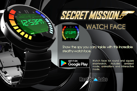
Secret Mission - Watch Face

4.4star
422 reviews
5K+
Downloads

Everyone
info


About this app
CAUTION: Only compatible on ANDROID WEAR or WEAR OS devices !!!
Who cares to be in trouble when you have the best spy watch !!!
Get the most advanced technology in you watch for the spy you have inside, like the secret agent of the movies, is not the best, is the right one.
What you see is what you get.
1.2 Activation, deactivation and click sounds volume corrected (down) was too loud.
V1.1 Some bugs fixed.
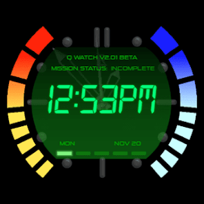
V1.0 Watch face for round and square smartwatch, includes ambient mode, animations and interactive mode.
Who cares to be in trouble when you have the best spy watch !!!
Get the most advanced technology in you watch for the spy you have inside, like the secret agent of the movies, is not the best, is the right one.
What you see is what you get.
1.2 Activation, deactivation and click sounds volume corrected (down) was too loud.
V1.1 Some bugs fixed.
V1.0 Watch face for round and square smartwatch, includes ambient mode, animations and interactive mode.
Updated on
Safety starts with understanding how developers collect and share your data. Data privacy and security practices may vary based on your use, region, and age. The developer provided this information and may update it over time.

No data shared with third parties
Learn more about how developers declare sharing

No data collected
Learn more about how developers declare collection
Ratings and reviews
4.1
252 reviews

Aaron Thelenwood
- Flag inappropriate
July 18, 2023
The overall design on the surface was exactly what I was hoping for. The face, the in-game menu screens, all scratched the nostalgia itch I was hoping for. Unfortunately, these same features also contribute to an overall frustrating experience. If you accidentally tap the screen, you are forced to cycle through each screen until you get back to the main watch face, which can make the core function of the watch (telling time) difficult. A quick home button would make a world of difference.
24 people found this review helpful

Todd Clarke
- Flag inappropriate
April 24, 2022
Really like the detailed execution but definitely needs to have the ability to show watch and phone battery life separately. Like left bars for watch and right bars for phone. Seems like updates don't come frequently with this app. And I'd like to have the option to turn off the step counter. Don't need that contributing to battery drain if I don't want it.
30 people found this review helpful

Kevin Kellerman
- Flag inappropriate
September 29, 2024
Pretty cool watch face if you're a Goldeneye N64 fan. That said, there's a couple of refinements they could make. The battery and tiur steps could be on the brand and blue bars separately, as it stands it move both with the battery. Also, the face is always in info mode, never just the watch fave which sometimes makes it hard to read quickly
1 person found this review helpful
What’s new
V1.4
App support
About the developer
REALITYLABS S A S
financiero@realitylabs.com.co
CALLE 53 C SUR 40 B 80 AP 301
ENVIGADO, Antioquia
Colombia
+57 317 6689782


